Tampilkan postingan dengan label Florence Peto. Tampilkan semua postingan

Jumat, 18 Juni 2010

Strawberry Reproduction


Strawberry Garden,
 Designed by Terry Thompson, appliqued by Pam Mayfield,
 Quilted by Lori Kukuk, Lawrence, Kansas, 2010

Terry Clothier Thompson has a new applique reproduction pattern out.

Strawberry Garden is a 4-block version of an antique quilt from about 1840-1880  in her collection.

Over the years we've noticed several of these 19th-century applique extravaganzas. I looked in my Encyclopedia of Applique under Fruit and found two versions.

The Indiana State Museum owns one that is a simpler block set in a 9 blocks with no border.

Here are three more 19th-century variations

This one was offered by the Pook and Pook Auction house on line.
A somewhat similar fruit was discovered by the Oral Traditions Project in Pennsylvania,  pictured in Jeannette Lasansky's Pieced by Mother on pages 56 and 57.


And this one from Florence Peto's collection
was offered by the William Bunch Auction house.


Above is one pictured in Hall and Kretsinger's Romance of the Patchwork Quilt.


Above and below are two late 19th-century versions
 that could be classified as pineapples, except they are pink.

Find out more about Terry's pattern by clicking here:

And see a reproduction strawberry made in 1983 by Hortense Beck of Topeka, Kansas, in the collection of the International Quilt Study Center & Museum by clicking here:

See another interpretation made in 1987 by Laverne Matthews of Texas by clicking here:

And finally a giant strawberry at the Quilt Index (it could be a pomegranate)


Jumat, 04 Juni 2010

Persian Pears & Florence Peto

Miscellaneous thoughts about paisley:

Magazine cover featuring a boteh or shawl print


Found this picture of a baby nurse wearing a terrific ruffled cape made of a paisley print, maybe in the 1870s.
It's from a blog called 19th-century American Women: A Museum in a Blog
http://b-womeninamericanhistory19.blogspot.com/


Wool/cotton blend printed in a paisley, about 1880

I wrote about the lack of historic sources for the term "Persian Pickle" recently. Click here to see that post:
http://siputflash.blogspot.com/2010/04/persian-pickles-and-shawl-prints.html


Indigo paisley border about 1890.
The jagged edges imitate the woven shawl designs.

I'm still working on sources for various names for the design. I was surprised to NOT find the word paisley in the Oxford English Dictionary---is the word not used in England? (ouch! there are a lot of negatives in that thought.)

12 hours later: I went to the library and read their edition in regular-size print of the O.E.D. Paisley is in there as "a garment or material made [in Paisley] or having the curvilinear design characterstic of cloth made there, or the pattern itself." The earliest use of the term Paisley shawl they cite is 1834; the earliest possible use of the word for a boteh pattern is 1898---"trimmed with paisleys."

While reading my notes about Florence Peto, who was a textile dealer and historian in the 1930-1960 years, I came across her reference to a paisley design as a "Persian Pear" in the Magazine Antiques in July, 1942, giving us another visual metaphor for the paisley cone shape or boteh.


The idea of a Persian Pear may come from oriental rug dealers. I found an article in a 1918 magazine criticizing all the imagined myths published about rug motifs.


As for the so-called Persian pear pattern, concerning which the rug books evolve so many fanciful theories, I know no more about it than they. But I do know that the Persians call it the bute, meaning twig or bush, by which they further designate the camel-thorn of their bare plains. And I have seen the same design on old Indian silks…
"About Rug Books" by H.G. Dwight in The Bookman Volume 46, 1918

Read more about Florence Peto by clicking here:

http://www.quiltershalloffame.net/index_files/Page854.html

http://mendofleur.com/2009/11/04/florence-peto-part-i/

http://mendofleur.com/2009/11/06/florence-peto-part-ii/


And here's a small stamped piece by Linda Frost.

She sees birds in everything, including butah, boteh and bute shapes.


Check her blog 13th Street Studio


Senin, 03 Mei 2010

Lafayette or Jackson?


I love the internet!


A few weeks ago I did a post about Centennial fabrics from 1876 and showed a picture of cotton printed that year with a portrait in a wreath. I identified the portrait as the Marquis de Lafayette, a revolutionary war hero who visited the United States in the mid-1820s. The Centennial print is supposed to be a reproduction of an earlier print done for Lafayette's return tour.

Detail of a nine patch about 1880

See it by clicking here:
http://siputflash.blogspot.com/2010/04/centennial-prints.html


Andrea sent a scan of some similar fabric she has, but she noted:

The coloring in my fabric seemed somewhat different from yours… Is it the same or different?
It is different. The most noticeable differences are details in the portrait and the color in the leaves in the wreath. Her leaves are overprinted with blue and yellow, a typical way to obtain green with natural dyes. The registration (overlap of colors) is off, a clue to a print before 1860 or so.

I think Andrea may have the original of that portrait print, probably from about 1830, a pretty rare item.

Marquis de Lafayette by Charles Wilson Peale
But I haven't felt good about that being Lafayette. Why do we think it is him being depicted on fabric about 1830 and again 40 years later?

It's because the standard reference says it's him. Herbert Ridgway Collins was curator of textiles at the Smithsonian when he wrote the book on the topic in 1979. Threads of History showed a swatch of the Centennial print with the caption that it's a portrait of Lafayette.

Apparently the Magazine Antiques showed a piece with that identification in the 1940s. Textile historian Florence Peto wrote a letter to her friend Elizabeth Richardson

January 16, 1945


Antiques showed that print one time too and published some speculation about it. Most people think it represents Lafayette; and that the cotton was to celebrate his second visit to America in 1824. I did a great deal of hard research on that cotton, trying to identify the portrait. I was one who questioned the identification of Lafayette. Why is he in an American uniform of the 1812 period? The uniform is that of our naval heroes of that period. But the face doesn't match any portrait I could find in an NY or NJ library or museum or historical society…

I saw that letter in the Richardson Collection at the department of  Manuscripts and Archives at the Kentucky Library and Museum last summer. I made a mental note to see if I could clear up the confusion. Like most of my mental notes it was completely forgotten.

But when I saw Andrea's fabric with a clearer portrait I realized it was President Andrew Jackson. Because of the internet I didn't have to do a "great deal of hard research." I spent about 20 minutes scrolling through portraits of Jackson and Lafayette.

Andrew Jackson by Ralph Eleaser Whiteside Earl, 1817

This portrait by his friend Earl shows Jackson as the hero of the Battle of New Orleans in 1815, when he was nearing 50.

There were many differences in uniforms of a General in the Revolution and a General in the War of 1812. Both feature gold shoulder epaulettes but Jackson's has a high collar with gold frogging.

The Earl portrait may be the basis of the toile depicting Jackson that is thought to be a celebration of his inauguration as President in 1829. Note the braid to the right of the buttons.

Older print on left about 1830
Newer one on right about 1876

The toile may have inspired the smaller-scale multi-color calico on the left, about the same time, with gold epaulettes, frogging and buttons.

Florence Peto worked so hard to find a likeness of Jackson that matched the cotton print. If only she'd had the internet. Read more about her at the Quilt Show by clicking here:

http://www.thequiltshow.com/os/articles.php/articles_id/21


The paintings are from the National Portrait Gallery.

Selasa, 24 November 2009

Indigo Prints: Resist and Discharged Figures


Julie in Tennessee sent me blocks removed from an old comforter cover. She'd received them from a friend who was a member of the Shields family of Cades Cove, Tennessee. The pattern is one I haven't seen.
The blocks look to be from 1890-1920 when indigo prints were relatively inexpensive and very popular with quiltmakers. They show typical indigo coloring with a dyed blue background and white figures, style dictated by indigo's chemistry. Indigo will not color if it is exposed to oxygen, so simply applying indigo to a wood block or copper plate does not work because the dye binds with the oxygen in the air.


Here's a date-inscribed quilt from an online auction with indigo blue as the ground and white figures in the print. It's a typical early 20th-century factory printed indigo.

Printers traditionally print white figures on indigo grounds in a reserve or resist process (also called batik) by applying wax or a resist paste in a pattern on the fabric and then dipping it in the indigo dye vat. When the paste is removed a white on blue design appears. Another technique developed about 1800 involves dyeing the fabric blue in the indigo vat and then printing a discharge paste to bleach out the figures. The prints in the Cades Cove blocks and Aunt Celia's quilt are probably done in a sophisticated variation of the discharge technique (although the pattern design is rather unsophisticated).
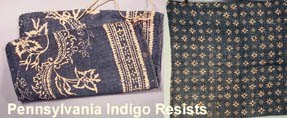
The indigo resist process has been used by artisans all over the world. Pennsylvania historian Trish Herr has been collecting early indigo resist prints from the Germanic people there. These are hand printed rather than factory printed.


And Japanese printers still dye in traditional fashion.

This quilt is called Japanese Coins, made by Georgann Eglinski from Japanese fabrics, 2009.

Printers figured out ways to reverse the figure/ground appearance in indigos. The earliest technique was the labor-intensive process of applying resist paste to the background and leaving the figures to absorb the dye. These indigo resist prints are sometimes called China blue prints because they look like a piece of porcelain.

Elizabeth Richardson Collection. Western Kentucky University Library

Above: a scrap of old indigo resist with blue figure and white ground from quilt historian Florence Peto's collection. She gave it to collector Elizabeth Richardson several decades ago. Recently, quilts, correspondence, and scrapbooks belonging to Elizabeth Richardson were donated to the Western Kentucky University Library. The note says "Very old blue-on-white resist print. F. Peto. For your collection. Happy Easter!"

Here are some reproduction fabrics imitating China-blue style with blue figures on white grounds.


A sofa upholstered in indigo-resist reproduction from Ikea

To see more reproductions do a websearch for the words: fabric indigo resist.

To see more about the quilt collection at Western Kentucky University click here for their online exhibit

And see how indigo yarn is dyed in a recent dyeing workshop in the Navajo nation by clicking here:
Related Posts Plugin for WordPress, Blogger...

LinkWithin