Sabtu, 30 Mei 2009

Christian Lacroix


The headline read that Lacroix has filed for the French equivalent of Chapter 11. This, a day after I had had a decidedly depressing reality check. I've grown used to the weekly news of one or another company hitting the sidewalk face first. This news was a misprint...it had to be. When you factor in the European fashion houses that have been the examples of individuality, masters of Haute Couture, household names and the pillars of this business, Christian Lacroix has been in that rarefied group since the late eighties. That doesn't include the years he shook the establishment and the world with his brilliance as the designer for the house of Jean Patou.
His first major contribution came with the modern version of the "pouf". It's volume and over blown effect was synonymous with the times in which it emerged. The world and this country were on a roll. Remember the Steinbergs, Saul and Gayfryd....the prince and Princess von Thurn and Taxis....Henry Kravis and Carolyne Roehm.....Bill and Pat Buckley,Nan and Thommy Kempner,Georgette Mosbacher, Anne Bass, Harriet Deutsch and on and on? These were some of the go getters in New York and internationally who personified the richness of the 80's. My god was it rich. Park Ave. was a boulevard of Bucks in a way it's never been since. Lacroix was the uniform of choice for those Ladies .He was the envy of Valentino, SainLaurent, Dior, Givenchy, Blass, Oscar, all of them. He struck a heavenly chord which no other designer at that time could play no matter how perfect their Piano.
When he left Patou to open his own couture house the world was lining up. There was nothing less than promise. The eccentricity that was born at Patou became something richer and more fully realized under his own name. I'll never forget the utter grandeur of his muse and most important model Marie Seznac, she of the silver grey hair who would later become the Directrice of the house. Every confection she showed was more startling than the last with a riot of detail, color mixes combining shades and hues straight from old master paintings. You'd see Goya or Winterhalter in a mix that seemed like madness but was so brilliantly controlled. The couture that Lacroix introduced was at once totally modern and unimagined . It hearkened to a time from the past but at once was totally modern...one without rules. Granted, it was for many an acquired taste , but something impossible to ignore. Impossible in it's ability not to seduce. Our eyes were forever changed.
With the new house came the ubiquitous perfume which did poorly and stresses mounted with the parent company LVMH. One thing led to another in the miasma known as Corporate. His house was sold to the Falic Group, a Texas based company whose DNA couldn't have been more alien to Christian's. But they moved forward despite that unfortunate shotgun marriage. Lesser priced collections spun off such as Bazaar and Christian Lacroix Jeans. Why everyone thinks jeans are the great pot of gold I have never understood, but there you have it.
It is not an official end to the house as there are suitors in the wings, but the Couture collection scheduled to show in July is in question as is a Spring 20010 collection. With a court appointed trustee one's future is not one's own. Others at this point call the shots. That is an ugly reality that can not be underestimated. As much as there is a future and desire in the public and the House in particular does not hold sway over a trustee. That person's decision is the rule of law.
With this in mind it is a very precarious and sad situation that the House of Lacroix must come to terms with. It has only rarely broken even or turned a profit since 1987. This is a documented fact which does little to bolster his chances of survival. He has always struck me as a realist and a very grounded man. I can only think that this turn of events is viewed by him as an opportunity and not a death knell. Opportunity has always come to him and there is no doubt that it will again.
Christian Lacroix may be one of the highest profile designers to be affected by this economic tragedy, but his example which will be one of humility and grace is a lesson to all who may find themselves in a similar predicament. One step back makes for the possibility of 20 steps forward. One must only believe and have faith. We are not our businesses and our businesses do not define who we are and the value of who we are.


I hope and believe that the future is a heartbeat away for him and for the rest of us who are on similar journeys, though they may not have been journeys of our choosing.

The Fashion Show?


I promised I would continue my coverage of this reality based train wreck and I've tried. I've honestly tried. I've set the TV to record it in case I have any excuse not to be home witnessing it and have managed pretty well. Nevertheless, I find myself checking in to see what new goodies they have in store for us the fashion starved. This brand of food will send us to an early grave. There are no nutrients in this glob of offal. It doesn't qualify even as suet. At least birds can find sustenance in suet. This is 100% sludge.

Isaac and Kelly and Fern don't even look amused. The guest audience of "industry giant" look appalled and I for one have had to turn it off more than once. The quality of entertainment and insight one expected to glean has become more a cautionary tale. If anyone with the brain the size of a bed bug still wants to be a fashion designer I would hope they'd consider advanced ambulance chasing or even intern as an assistant crack whore. This view of fashion takes the aspiring designer straight to hell. Though hell is paved in good intentions there is little room for these duelling designers (with 1 or 2 notable exceptions). I've rarely seen such a hodge podge of mean spirited chest stabbing neverwillbe's.

The absurd tests and challenges are things no self respecting designer would ever attempt. Quality has always been the last word in design or any pursuit for that matter. Imagine altering a botched shoulder pad in a lined jacket? That translates to opening the lining, re-setting the pad and then closing the shoulder seam of the lining ....by hand. Oh, and then there is re attaching a botched zipper and hemming a skirt, both things also by hand. I forgot to mention you have about 20 minutes to do all of those tasks. For the layman with no experience in these things , any 1 of the separate tasks to be done correctly and neatly takes at least that long. So to judge a contestant on their ability to pull it all off in the allotted time isn't a test, it's a travesty.
Now let's turn a jacket into a multipurpose garment that is functional, original,skillfully constructed and ultimately qualifies as FASHION. They all lost unless you consider an ugly ski suit with a wrap around blanket shawl or a down sleeping bag coat (a quilted body bag is closer to the truth) that you can sleep in on a sidewalk when you've been booted from your 12th job on seventh ave.as FASHION.

At this point I lost interest, my dinner started to back up on me and I couldn't sit and look at Norma Kamali or any of the other celebrity guests aping interest. If any one of you was questioning if fashion is alive or dying the celebrity jury is still out. This humble viewer has to weigh in. It's in it's tertiary state. It's time to call a priest in, start gathering wood for the pyre or run to the nearest Home Depot and buy a shovel. Any plot of earth will do. Start digging and buy some lye while you're at it. Methinks there will be a stench like we've rarely experienced.
I will not bore or horrify you with more coverage on this show. There's more to be had watching an infomercial or pulling your own wisdom teeth with toy pliers.

Isaac, Kelly (whoever you are) and Fern, you should all apologize to the viewing audience. One can not squeeze caviar from a slug. This menu are slugs served 10 different ways, and none are palatable or remotely yummy.

Isaac and co.....Bye Bye Darlings!

Jumat, 29 Mei 2009

Cat Condos on the Mediterranean


On the way to dinner we met a colony of feral cats who live among the rocks abutting the beach. True heirs of Darwin, their patchy colors mime those of the rocks, so many of them blend in with the landscape.


It’s rather strange to see cats in such proximity to a large mass of water, but these live in these condos with a sea view (better than the commnuities of rats living in garbage bags on the streets of NY). Cats being cats, their gaze is transfixing. I think they gaze at us because they are hungry. But their eyes are still mysterious.

Talking about garbage, Málaga is kept spotlessly clean. There are armies of street cleaners and it shows.
I don’t mind a clean city at all.

Malagueña Salerosa


Darlings! Greetings from Málaga, Spain, where yours truly is attending an international wedding between French and Spanish subjects, and generally having a beautiful time in this mediterranean port city with lots of joie de vivre, a la española.


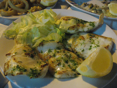
Yesterday we had a soupy paella overlooking a garden. At night we went to one of the little restaurants at the beach in Pedregalejo (about an hour walk from the center, by the sea) and had a fish and seafood feast for a very reasonable price. Fresh tiny clams, other spectacular clams called conchas finas, an amazing fresh grilled dorade, a perfect simple salad with lettuce, tomato and onion, and perfect glasses of beer, the way you can only get in Spain. I declared myself officially happy.


Today, a perfect breakfast of fresh orange juice and a pitufo catalán, which, is not a catalan Smurf, but a small baguette, like a Mexican bolillo with Serrano ham, olive oil and tomato. YUM.
Turrón ice cream at Casa Mira. Qué cosa más buena.
The weather is superb, sunny yet not hot. The wedding is tomorrow.

Selasa, 26 Mei 2009

No More Cars in Times Square

Splendid idea. I say follow it with no more cars in Manhattan.

The Bronx Bomber

Sounds like Supreme Court Nominee Judge Sonia Sotomayor is going to bring some much needed fun to the august court.

1. She from the Bronx. New York is in the house. Represent! She ain't gonna take no bullshit from the rightist bullies on the bench.
2. She's the first Hispanic Supreme Court Judge ever. Neat.
3. She's a woman and apparently a feisty judge. Fun!!!!!

To wit:

Judge Sotomayor has said her ethnicity and gender are important factors in serving on the bench, a point that could generate debate. “I would hope that a wise Latina woman with the richness of her experiences would more often than not reach a better conclusion than a white male who hasn’t lived that life,” she said in a 2002 lecture.

Word.

She also once said at a conference that a “court of appeals is where policy is made,” a statement that has drawn criticism from conservatives who saw it as a sign of judicial activism. Judge Sotomayor seemed to understand at the time that she was making a controversial statement, adding that, “I know this is on tape, and I should never say that, because we don’t make law.”

Conservatives quickly pointed to such statements after word of her selection on Tuesday. “Judge Sotomayor is a liberal activist of the first order who thinks her own personal political agenda is more important than the law as written,” said Wendy E. Long, counsel to the Judicial Confirmation Network, an activist group. “She thinks that judges should dictate policy, and that one’s sex, race, and ethnicity ought to affect the decisions one renders from the bench.”

Yay!

White House officials concluded that such statements, while perhaps providing fodder for opponents, would not be problematic enough to hinder her confirmation. Some officials have said in recent days that they relish the prospect of Republicans standing up against a Hispanic woman with her life story, because it would only damage the G.O.P. with a key voting bloc.
Bring her on!

Senin, 25 Mei 2009

On a clear day you can see forever

I'll pay $199 not to have to take off my shoes in the security lines at the airport. I absolutely loathe the shoe routine. There is this thing called Clear that for $199 a year promises to breeze you through security. I say the absence of aggravation is worth it. But they don't say if you still have to open your laptop and take off your shoes. And also, only at selected terminals at certain hours, which starts sounding like bullshit. Like for instance, 4 am to 7 pm at Terminal 3 in JFK. This means that if you are taking a red eye to Europe after 7 pm, you are not eligible. And then, supposedly you fill out the megillah of your life and then you go to a center to have your iris and fingerprints scanned and two weeks later they send you your card IN THE MAIL, how safe is that, where a regular Osama Bin Laden can nab it and use it.
Still, the dream of more pleasant air travel is powerful.

Minggu, 24 Mei 2009

God of Carnage

It was better than I expected. Lots of fun, but not much else.
The set is gorgeous. The actors are all fine, but they seemed generic. Perhaps is because of the way the characters are written, more as stereotypes than as individuals. (Cf. the characters in the Norman Conquests, who are complicated people, not symbols thereof).
They are supposed to be 2 New York couples but they seemed unrelated to this city. My favorite was Hope Davis. She rocks. She is funny and real. Gandolfini is his usual adorable gruff bear, very natural but not very surprising. And Marcia Gay Harden and Jeff Daniels are fine but why do I feel they belong in Wisconsin?
Imagine Alec Baldwin in Daniels' part. That would be so much more fun. He would tear it apart. Or Marisa Tomei in Harden's part. Much more Brooklyn, much more pizazz. I also felt that the characters should be younger than these actors. Early 40s, more at stake and more to lose in the bargain.

Kamis, 21 Mei 2009

Random Thoughts

1.
I feel blessed and overjoyed that I don't follow American Idol and I don't care. The same goes for any reality show.
2.
Satan (that is you, Cheney): shut the fuck up already.
3.
I'm seriously considering canceling Netflix. Each movie is costing me like $60 each. Much as I love it, I'm not using it anymore.
4.
It's finally beautiful out.
5.
I have become a master procrastinator.

John Hewson


I've been studying the prints of John Hewson, a Philadelphia wood block printer who was in business from 1774 to about 1820. He's sometimes credited as America's "first calico printer," but there's no way to know who was America's first calico printer. Several people left records earlier than Hewson, though.

The bird is from a snapshot of a Hewson print I took at an exhibit at the Winterthur Museum a year or two ago.


I made a list of all the quilts and counterpanes featuring Hewson's fabric that you can see online. Here's one from the Winterthur.
http://content.winterthur.org/cdm4/item_viewer.php?CISOROOT=/quilts&CISOPTR=380&CISOBOX=1&REC=2

To see more go to my web site http://www.siputflash.com/---to the subpage "Quilt History."
http://www.siputflash.com/faqs2.aspx
At the bottom you'll see a list of clickable quilts.

I am going to do a luncheon Roundtable Discussion called "America's First Calico Printer" at the American Quilt Study Group seminar in San Jose in October. It's time to start signing up so click here to find out more about the seminar.
http://www.americanquiltstudygroup.org/seminar.asp

Senin, 18 Mei 2009

Recent Faves from The New Yorker

As I really am at a loss on what to tell you, darlings, here are two links to recent pieces in The New Yorker that I liked.
The first one is one of the only truly funny comic pieces in the humor section Shouts and Murmurs, which is usually insufferable. This litte gem is by Noah Baumbach (whose movies are usually insufferable) and it is about a bee on blow.
And this one blew my mind. It's not totally available yet on the net, but it's on last week's issue.

Bye Bye Darling.....


Those are Isaac Mizrahi's parting words to the poor unfortunate who finds himself out of the race for super fashion show stardom. It's his Heidi Klum dismissal. The 3 words that will haunt the shattered contestant , and we the audience once he's uttered it about 2 or 3 times more. On the first episode he said it at least twice.
Well the first episode got off to a rollicking start in total copyright infringement fashion. It is a poor man's project Runway and that isn't saying much. Especially, when you consider PR is about as bankrupt a sorry assed scripted pseudo reality show can get. The Fashion Show starring the irrepressible Isaac( I'll do absolutely anything vulgar, affected, crass and insipid ) Mizrahi and Kelly(where the hell did they dig her up?and by the way, who is she and what credentials if any does she have as a judge/host/critic) Rowland and Fern ( I can get you a venue, lights, seating and a steamer for your runway show, but it's gonna cost ya) Mallis, and a special guest judge from the heights of 7th Avenue Aristocracy. In this case it was the humble and benevolent uber design genius Ellie Tahari! WOW!!!!!
The "talent " was iffy at best and appeared to be the rejects from PR. The most memorable by far was the evil latin cross dressing dwarf Merlin. He snapped and bitched his way through the first mini challenges and managed to alienate every contestant in the first 10 minutes. He undoubtedly alienated the whole viewing audience . For this reason he will easily be every ones favorite and the show's nemesis. In the self confidence dept. he's got it hands down. Nothing shakes him. He is totally and utterly politically incorrect , selfish, controlling ,self absorbed and bent on undermining all the others. He's clearly got what it takes to shine in this biz: a smidge of talent and a frightening attitude. His drag is a bit off putting but I guess he's the latin version of Thom Browne; inappropriate and ludicrous get-ups....but again those are magical ingredients.
The challenges and the whole concept of the show complete with the arch editor from some marginal magazine makes it just an ersatz version of it's step sister Project Runway.
Why this gang got together to put on such a silly and sad sloppy seconds version of the original is just beyond me. It's not like watching a car wreck. It's more like watching the folks who will end up in all that twisted metal get into the car, not bother with seat belts, look for the car keys(which they can't find ) and eventually opt for taking the bus. In other words, the hook factor is missing. Nothing happened but bad , boring bullshit. The runway itself is the star of the show. The industry titans who watch the shows and judge are a bunch of B-listers. When Cynthia Rowley isn't even at the table you know they're scraping. But then again, it was the first episode so there's time for them to talk to Cynthia's people and get her on.
The piece de resistance was when they had a super duper socialite as one of the challenges for the "designers" to dress for a series of VERY important events she would attend. They need to design around her trademark tresses and enhance her mega-watt, high voltage fabulousness.....When the door opens and in slithers Tinsley Mortimer I almost threw my WII
remote wand through the screen of my 60"plasma.
At this point it was either time for more meds or work it through like Adam my therapist suggests when the world becomes all too much. So I'm working through this with your help. We have to fight the urge to look away because there is a life lesson to begleaned watching this "Reality Fashion Show". What that lesson is I'm not in the least bit clear but by season's end , I'm sure one of us will figure it out.
Let's keep in close touch. Maybe we can help each other through the horror and grief that will rain down on us . But never fear, Fluff is here and I've got at least 3 or 4 lives left. If this thing kills you, I will survive it and caution those who come after that the travel channel or that infomercial on freebie wheel chairs are more satisfying educationally and have more humor, like when Nana does 360's in her chair and doesn't hurl.
Til next week," Bye bye Darling."

Welcome to Venice...

...California.


Kamis, 14 Mei 2009

L.A. Confidential


Even fun has business hours.

The land of the free, allright.

That's where I'll be.

"You can check out any time you like, but you can never leave..."

Selasa, 12 Mei 2009

The Art of Words: 15 Creative Typography Artworks

typographic-art-main

Typography is much more than just graphic design or illustration with some text thrown in. It’s an art form in itself that combines carefully chosen and arranged fonts with visual elements, sometimes as a relatively straightforward communication device and sometimes as artistic expression. These 15 examples of typography artwork embody a broad variety of techniques and styles, but they’re all brilliant.

Swing City by Luke Lucas

luke-lucas

(image via: Luke Lucas)

Art director, co-founder of creative studio Lifelounge and typographic illustrator Luke Lucas creates artwork that combines text with often-provocative images, as in this typographic title treatment for an article in Lifelounge Magazine about swingers in America’s bible belt.

Destructive Vintage Typo Experiment by Alberto Seveso

alberto-seveso

(image via: behance.net)

Roman artist Alberto Seveso has a singular typographic design style, taking a traditional approach to graphic design rather than using computers. In a series of images called ‘Destructive Vintage Typo Experiment’, Seveso combines a 1970s-inspired type style with bits and pieces of line work, splatters of watercolor paint and sunny, vivid hues.

Good Morning Stranger by Nicholas Alexander

nicolas-alexander

(image via: behance.net)

Toronto designer Nicholas Alexander shares his typographic illustrations on his portfolio blog Good Morning Stranger, for which he created this three-dimensional blog header.

Forget the Past by Craig Shields

craig-shields

(image via: abduzeedo.com)

Most of Craig Shields’ digital illustration is figurative rather than typographic, but this piece stands out among his portfolio. It reads ‘Forget the past, look to the future’.

‘Empire’ by Theo Aartsma

theo-aartsma

(image via: Sumeco)

Dutch designer Theo Aartsma combines digital and traditional techniques to explore themes of nature, technology and urban culture. Aartsma’s typography art often has an organic feel, seen here in ‘Empire’, which was created for depthCORE’s Empire release.

Don’t Panic by Stefan Chinof

stefan-chinof

(image via: boogiesbc.ro)

Bold and colorful, Bulgarian typographic illustrator Stefan Chinof often uses negative space among complex designs to spell out text, as in this piece, ‘Don’t Panic’. A recurring theme in Chinof’s work is liquidity, from dripping abstract shapes to illustrations disappearing into splatters of paint.

Chaos is My Name by Berk Kizilay

berk-kizilay

(image via: deviant art)

Berk Kizilay’s typographic work is chaotic and masculine, standing in contrast to the figurative illustrations in his portfolio which have a sensual an almost airbrushed look. Kizilay layers text and design elements into compositions that are almost architectural in nature.

Typoplastic Surgeries by Oded Ezer

oded-ezer

(image via: WebUrbanist)

Oded Ezer stretches and blurs the boundaries of typographic illustration, integrating science to create bizarre works like his ‘Typographic Surgeries’. Oded literally attached letters to his own body and face, saying “The connection is between the letters to the face, kind of an evolution of both. I began the process in a graphical manner, but then I tried to implement it physically. So this augmentation, deformation of the body, the revelation of its typographical perspective is what turns me on.”

All Work and No Play by Craig Ward

craig-ward

(image via: Debutart)

Craig Ward is a London-based graphic designer who seeks to explore the notion of word as image, often employing unusual media like feathers, paper cut-outs and in this case, human hair to create his designs.

‘Words of Change’ by Gui Borchert

gui-borchert

(image via: Gui Borchert)

This entirely typographical portrait of President Barack Obama was created by artist Gui Borchert from 20,000 of Obama’s own words, meticulously arranged in various sizes and colors. Borchert, an art director with a large body of typographic work, was featured in Print magazine in 2007 as one of the 20 most talented designers under 30.

Letters are More than Words by d0rn

d0rn

(image via: Deviant Art)

This piece by artist d0rn proves that, as the title says, letters are more than words. They’re arranged here into a flowing, three-dimensional looking mass that almost seems alive.

Radiohead’s Thom Yorke by Steve Yee

steve-yee

(image via: Style Files)

Steve Yee, art director for Chiat/Day in Los Angeles, designed a series of typographic posters for the 2009 Grammy Awards including this colorful portrait of Radiohead’s Thom Yorke. The words used throughout the portrait are the titles of some of Yorke’s favorite songs.

Typographic Skin Condition by David Tucker

david-tucker

(image via: Inxel)

Not many illustrators – except maybe Oded Ezer – would go so far as to scratch words onto their skin, turning their bodies into a painful canvas. ‘Typographic Skin Condition’ by David Tucker is more than just a masochistic sort of temporary inkless tattoo – it’s a combination of performance art, photography and a love for type.

Heart by Yulia Brodskaya

yulia-brodskaya

(image via: artyulia.com)

Yulia Brodskaya combines typography with papercraft art to create three-dimensional designs that really pop. Brodskaya, a Russian artist living in the UK, sought to bring together her love for the two separate art forms and has done so beautifully, with a style unlike any other.

A Simple Typographic Pledge by Jeff Matz

jeff-matz

(image via: Swiss Miss)

Anyone with an appreciation for good typographic design will get a kick out of this poster by Jeff Matz, Principal of Lure Design. If only the cringe-worthy Hobo, Comic Sans and Papyrus fonts would disappear for good, designers everywhere would celebrate.

by.WebUrbanist


Senin, 11 Mei 2009


Hexagon blocks about 1830-1850
These hexagons are pieced over paper in the technique we might call English paper piecing. The seamstress basted the fabric over paper hexagons cut from old letters or ledgers and then whip-stitched the hexagons together.

If you'd like to know more about needlework techniques like paper piecing and whip-stitching and how to use them to date antique quilts you will want to go to my webpage. On the page called Clues in the Calico you will find at the bottom files labeled "Clues in Techniques." I've put ten different files up there with information about dating quilts using everything from applique to zig-zag stitch. It's an update to my 1989 book Clues in the Calico. It seems like this information, too big for a book, can be most useful digitally stored on a giant server---somewhere---where people can read it.

Click here: http://www.siputflash.com/faqs5.aspx

Minggu, 10 Mei 2009

Margaux Hemingway was my Muse


Long ago when I was a kitten , happy in the safety of home and only curious about life I discovered Vogue Magazine. This incarnation of Vogue was very different than what it is now. Diana Vreeland was in the driver's seat and it opened the doors to a world of sophistication, glamour and mystery.
I would curl up on our sofa under the window where the sun would warm my back and spend hours entranced by every page and all it offered up to the senses. Even the typeset and the size of the magazine was enthralling. It was a much magazine in those days. We're talking 1972 or so.

My interest in fashion and fashion magazines were the worlds they conjured. Part of me knew it was artifice , but the other part knew instinctively that artifice and imagination could be the sole ingredients in creating a way of seeing and living....a real world of one's own making. Vogue did that for me, and for that I will be eternally grateful. My disillusionment with what that magazine has become can never take that away from me. I designed my world long before they went to work disassembling it.

The spell that held me wasn't specifically a dress, the cut of a gown or the way a sleeve was set , but more the overall mood that the photographer's eye captured. Fashion was synonymous with a way of looking at the world. It meant a heightened existence, not school uniforms, gym class , Little League or choir rehearsal on thursday nights. Fashion was a place with an address that was mine.
There were lots of fantastic models in fabulous clothes, makeup, and jewels , but it wasn't until I stumbled onto my first issue that had Margaux Hemingway on the cover with a huge spread inside that I became fixated. She would become my definition of and the personification of beauty. From that moment , Fashion had a face and a body and it belonged to Margaux.
This is still years before I considered fashion as a career. Frankly, I didn't understand that it could be one, certainly not one for me. Where I grew up, fashion wasn't even a topic of discussion. Certainly, not a topic for a 12 year old boy. So it was my own precious secret.

When I fantasized about my future, Margaux was my pal. When I thought up wild getaways to Marrakesh or Tahiti, she was my travel mate. I wanted to watch her dress, put on make-up. I wanted to brush her eyebrows....oh God, those heavenly eyebrows. Her beautiful athletic body and naturalness that was evident even then to a kid. There was something so real and open that photographers consistently captured. In retrospect, I believe she was incapable of hiding or separating who she was as a person from the glamorous model on the page. It was Margaux completely done, or Margaux the person. It's this quality of realism, even superbly transformed and heightened that sparked my imagination. This is the quality in models who would come later who inspired and haunted me. There is something about my personality and theirs or at least the look of them that touches me. The bizarre and unnatural do nothing for me. Natural beauty complete with flaws excite me.

Margaux had a meteoric rise to fame and then a life with many problems that were never kept private. The press was all over her and helped to shorten a life she struggled to get and keep on course. To this day I feel a loss when my thoughts wander back. The Met exhibit on Models as Muse, makes me think a lot about the different faces that launched a thousand ideas. Her face and beauty alone set me on my path.

Ironically, shortly before she died I had the very unexpected pleasure of making her acquaintance and thanking her for the gift she gave me, the one of which she was wholly unaware. It was pouring rain on a late afternoon and I was walking down Madison Ave. looking in boutique windows. At a red light I found myself standing with my umbrella next to a very tall and soaking wet woman trying to hail a cab. Instinctively, I offered to share my umbrella while she waited for a cab to stop. When she faced me to say thank you and how sweet I was to shield her, I realized it was her. I was stricken and struck dumb. But , as you don't come face to face with your dream model everyday, I introduced myself and gushed . She seemed so surprised and moved. I wished her well and told her what a fantastic model she was, that she was my muse for many years.When the cab came, I opened the door for her and she gave me a warm embrace and kissed my cheek. As the cab pulled away she lowered the window and waved goodbye.
I continued down the ave. but now with out my umbrella. I gave it to her to keep; a small token of my appreciation. It didn't matter that I was drenched, now. At least the people I passed didn't notice the tears streaming down my face.

Joy or sadness?It's hard to say. They both are so closely aligned.
Related Posts Plugin for WordPress, Blogger...

LinkWithin